Category: Uncategorized

  • Conservatorio Vincenzo Bugeja

    Conservatorio Vincenzo Bugeja

    An historic institution entering public view needed an identity that reflected its enduring purpose—formal, restrained, and rooted in legacy.

    Context

    Conservatorio Vincenzo Bugeja had existed quietly for generations—managing properties, fulfilling its philanthropic mission, and remaining largely out of sight. For years, it had no online presence and no intention to engage publicly. But with renewed internal direction, it became clear that the institution could no longer remain invisible. The mission was well established. What was missing was a public face—something clear, formal, and considered to carry its presence into the public domain.

    Fit & Intent

    This wasn’t about marketing—it was about formality, structure, and alignment. Conservatorio Vincenzo Bugeja didn’t need to be invented. It needed to be presented. The intent was clear: establish a respectful, serious visual identity that matched its institutional weight. A logo was required, but one that respected tradition without defaulting to nostalgia. The process had to tread carefully between heritage, neutrality, and distinctiveness—something that could carry real authority without overstating itself.

    Direction

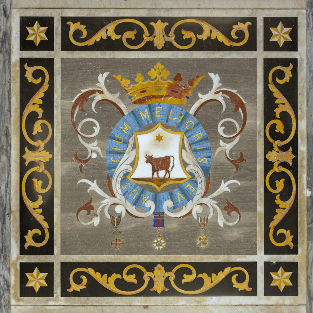
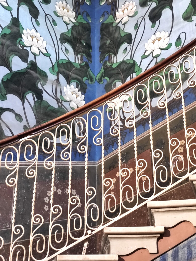
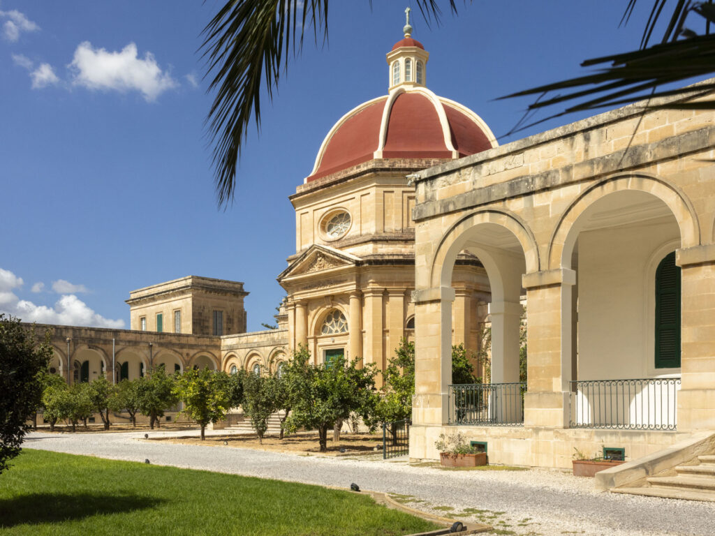
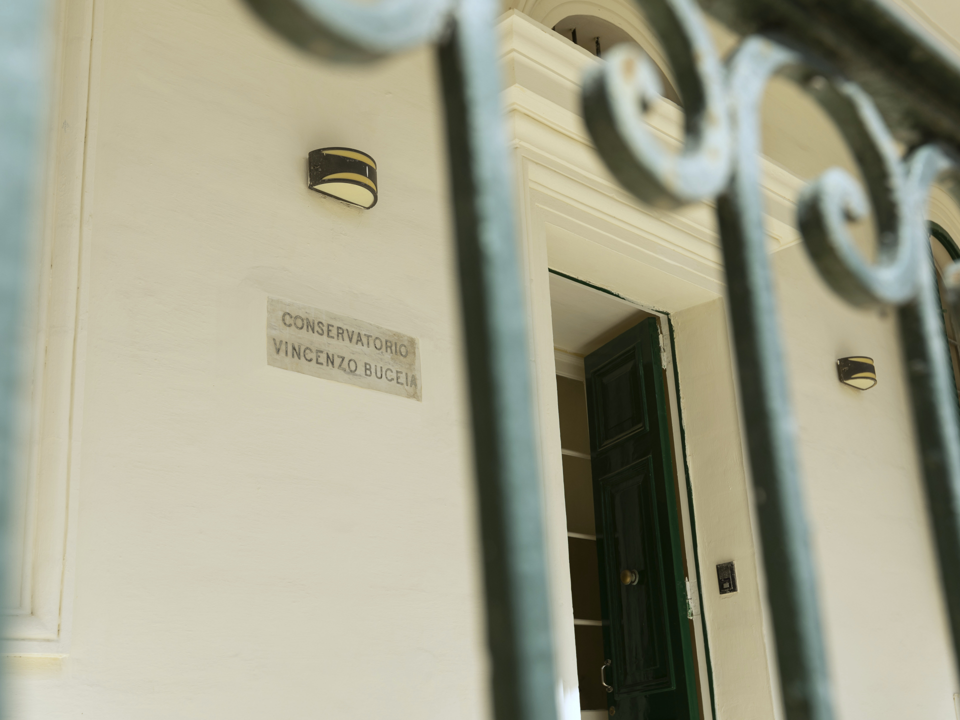
    The starting point was the institution itself—its architecture, signs, and visible symbols. Everything pointed toward a brand that needed to feel classical, formal, and established, without becoming decorative or nostalgic. Conservatorio Vincenzo Bugeja has a strong institutional voice rooted in tradition, and the identity had to reflect that—clearly, without noise. The work focused on interpreting existing material rather than inventing something new, always guided by the question: how do we honour legacy while creating tools fit for today’s public presence?

    Outcome

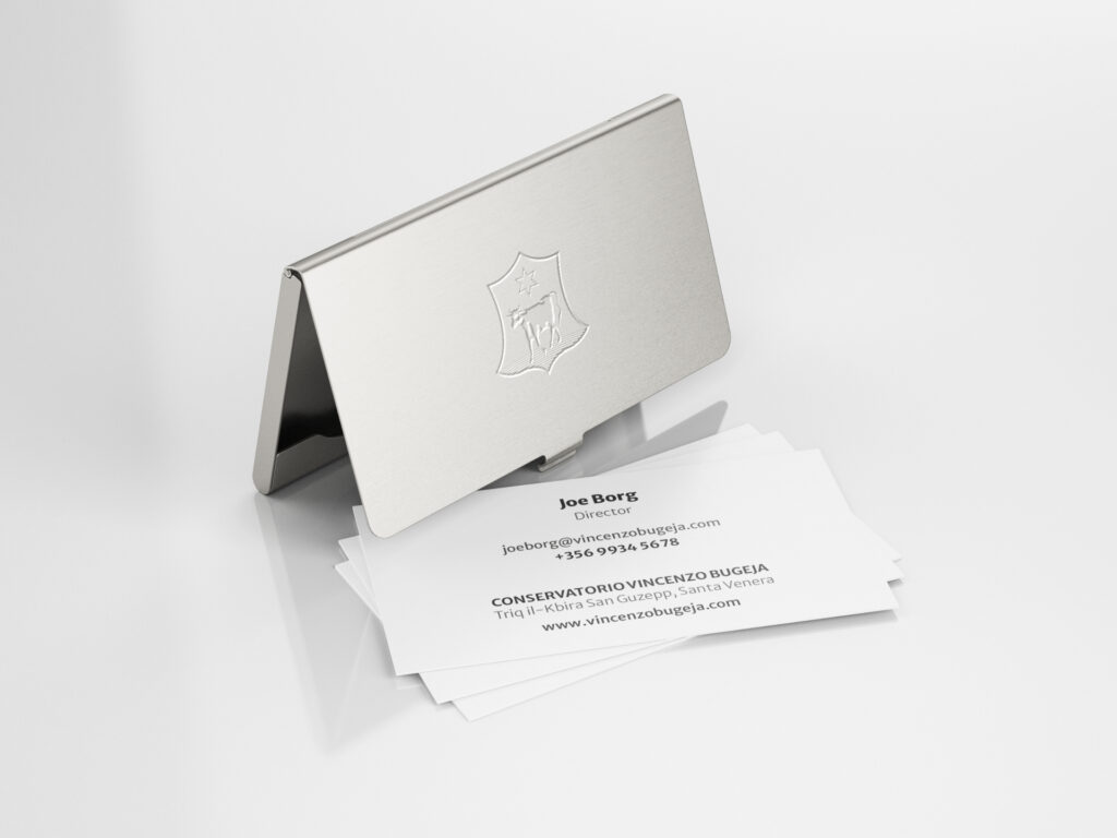
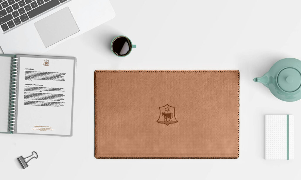
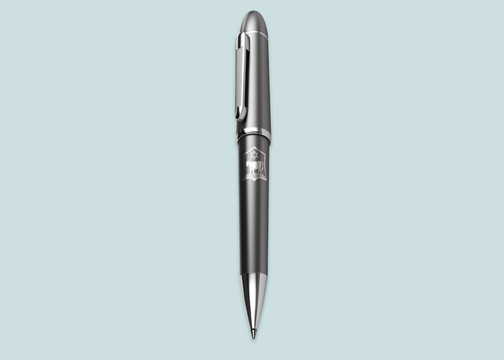
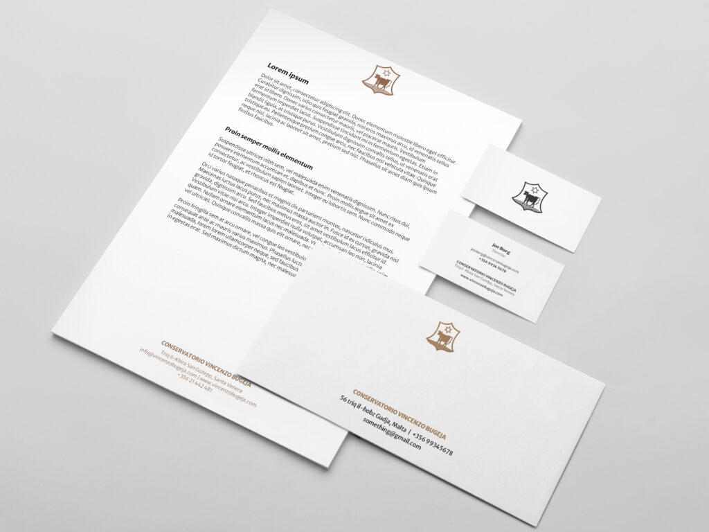
    Conservatorio Vincenzo Bugeja now has a complete logo system, made up of a reinterpreted wordmark and a monogram rooted in the institution’s own architectural detail. The formal tone of the identity is reinforced through a restrained colour palette drawn from the apertures of its buildings. Core stationery and templates were developed to standardise communication, alongside a website design that introduces the Conservatorio to the public for the first time. The result is a clear, formal identity that holds its ground—practical, recognisable, and aligned with the institution’s enduring role.

  • Siggiewi Rowing Club

    Siggiewi Rowing Club

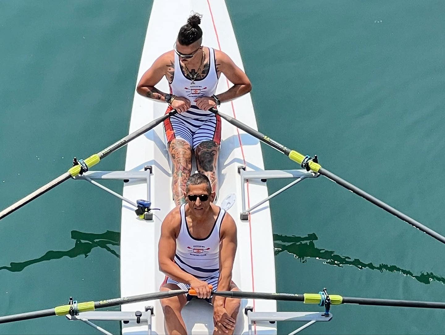
    A young rowing team with big ambitions needed a visual identity that could hold its own—on local waters steeped in tradition, and on international stages defined by performance.

    Context

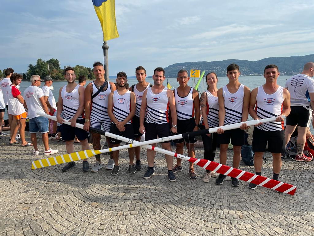
    Siggiewi Rowing Club was a new presence in a very old sport. Locally, it needed to stand beside historic rowing clubs steeped in Maltese tradition, all of which had long-established colours and emblems. Internationally, it was entering a completely different space—one where gear, oars, and performance visuals carried most of the recognition. The team had already chosen orange as its core colour and had begun using the Siggiewi crest in early materials. Now, on the cusp of official competitions, it needed to formalise and scale its identity fast—without losing what it had already started building.

    Fit & Intent

    This was a team that moved quickly and thought ahead. The identity wasn’t starting from scratch—it needed to sharpen what already existed. The aim was to create something that could hold up in the Grand Harbour without clashing with rival clubs, and at the same time stand out clearly in international regattas where visibility, cohesion, and confidence matter. The intent was to build recognisability across every setting—gear, boats, flags, media—without getting bogged down in heritage mimicry or over-design.

    Direction

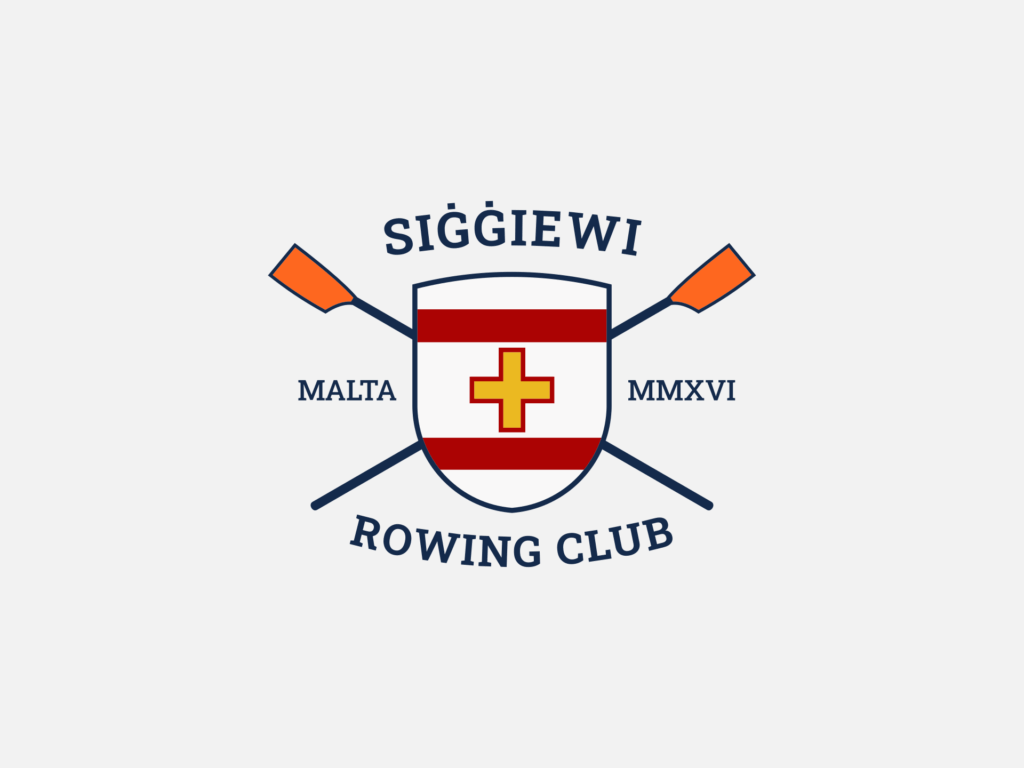
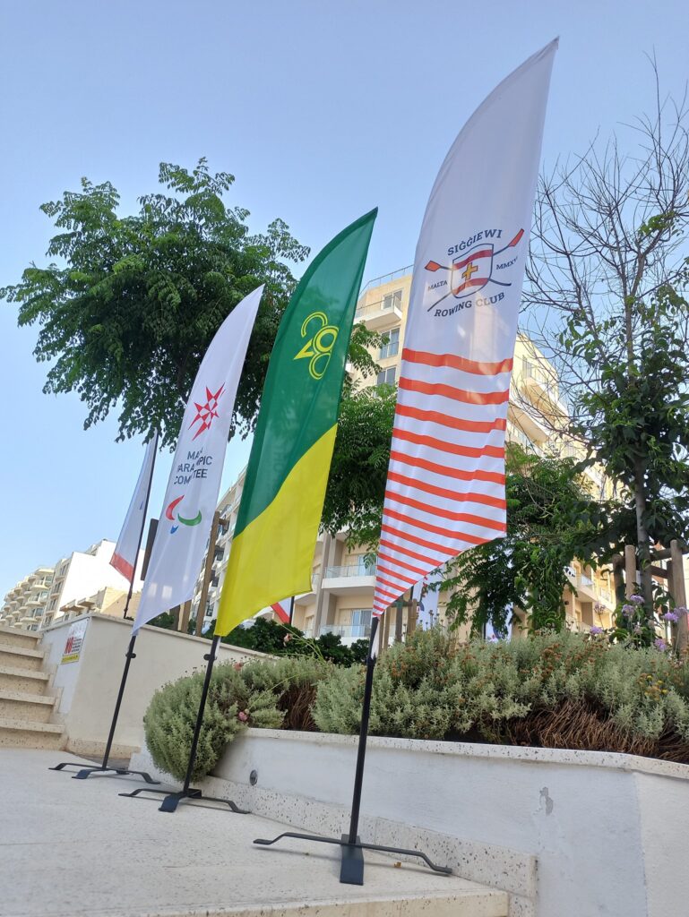
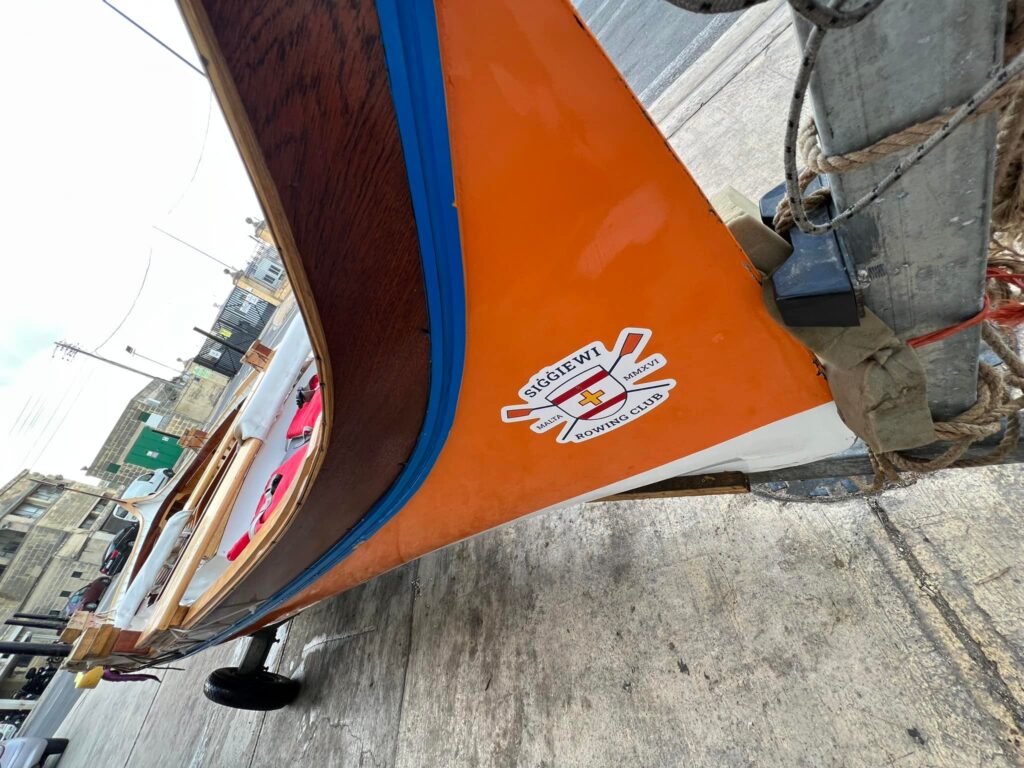
    The approach focused on formalising, not reinventing. The Siggiewi crest was retained and refined, and the team’s chosen orange became the foundation for a clearer, bolder identity system. Angled stripes were introduced as a visual nod to oars cutting through water—dynamic, simple, and immediately applicable across scales. The system needed to move easily between stitched gear, fibreglass hulls, and digital layouts, so every visual decision was stress-tested against where and how it would be seen.

    Outcome

    Siggiewi Rowing Club now has a full-colour identity that is both grounded and distinctive. The logo system has been applied across boats, team gear, flags, and digital materials. The angled stripe motif provides an expandable graphic language that’s recognisable on the water and on the world stage. The team now shows up with presence—unmistakably Siggiewi, whether racing along the Grand Harbour or lining up internationally.

  • Alpha Rental

    Alpha Rental

    A rental company in a fast-moving industry needed a visual system that could brand equipment on the fly—without full wraps, without custom jobs, and without losing recognition in a sea of machines.

    Context

    Alpha Rentals operates across Malta, providing event equipment, vehicles, and industrial gear for short- and long-term use. With machinery constantly in motion—often placed alongside equipment from other contractors—the brand struggled to remain visible or recognisable on-site. Full wraps were rarely practical due to cost, time, or surface irregularities. Yet, without a system, their presence disappeared into the background. The goal was to create something durable, visible, and deployable in real time—without redesigning every machine.

    Fit & Intent

    The brief was focused: keep the name, keep the monogram—but update the presentation and make it work in tough, visual, real-world conditions. This wasn’t about making something “beautiful.” It was about function: being noticed, being remembered, and being unmistakably Alpha in a cluttered environment. The conversation quickly moved past branding theory into practical questions: What do we do when there’s no budget or time for wrapping? How do we compete with machines that are already bright yellow, green, red, or blue?

    Direction

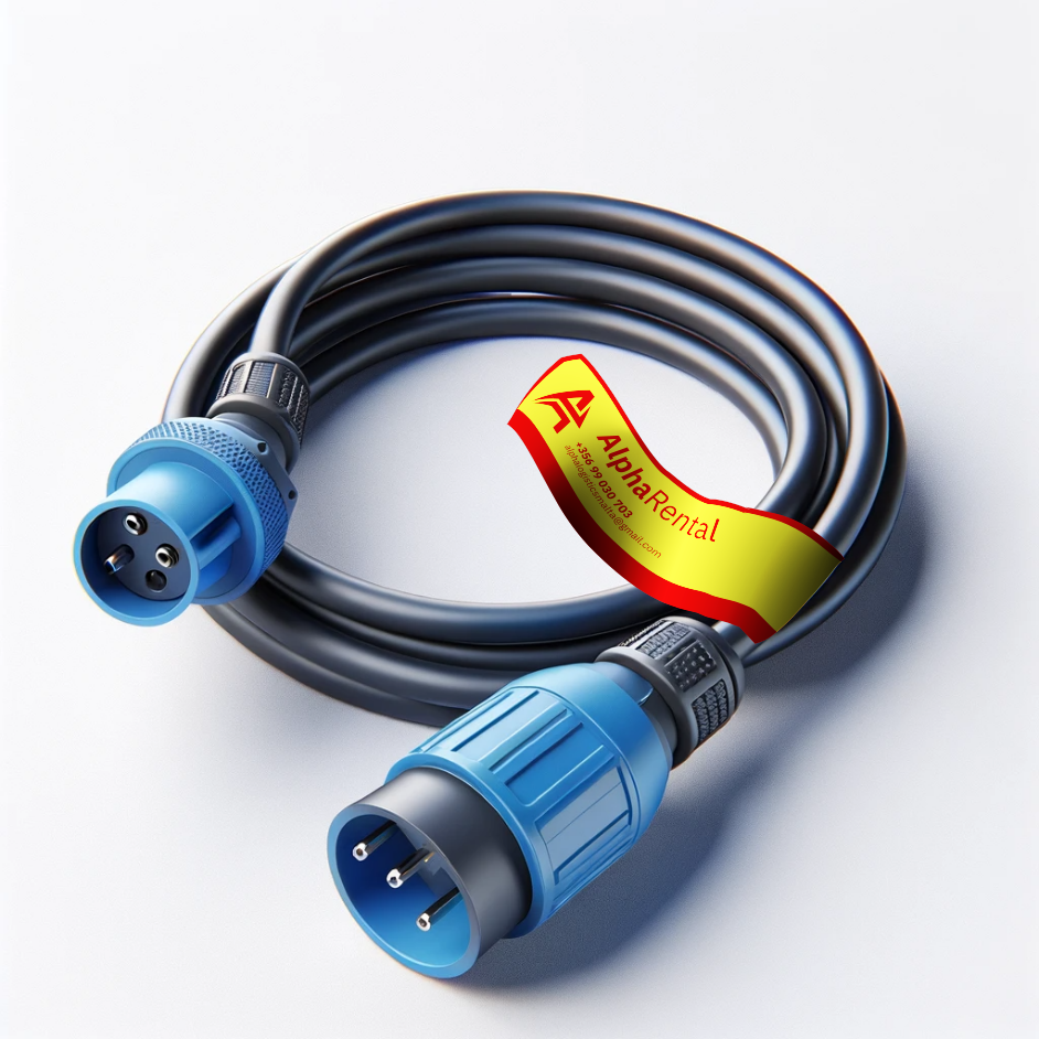
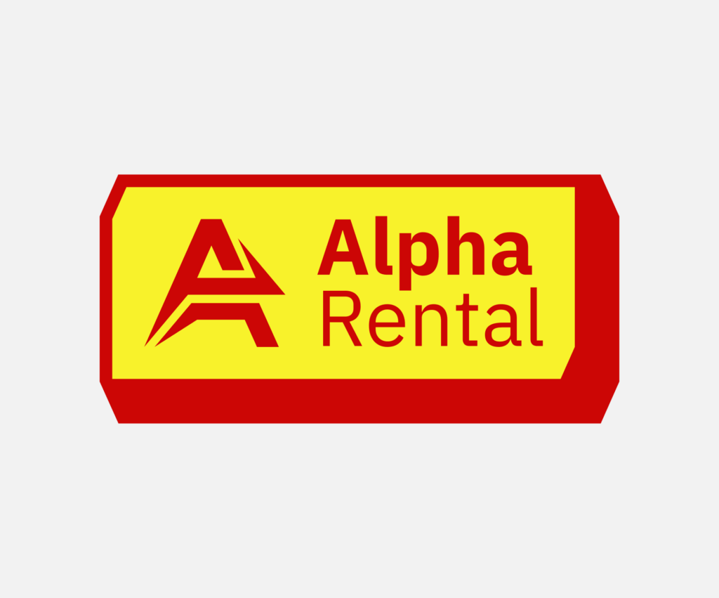
    The approach centred on building a labelling system, not a visual identity in the traditional sense. Alpha’s inventory was reviewed and mapped out colour conflicts, material constraints, and size variability. Standard industrial signal colours were used as a base, then subtly refined to create a recognisable palette. The solution: a boxed label format with a hard border, designed to contrast with any equipment colour, housing the logo and contact info. In larger applications, the sticker shape itself became a distinctive visual asset—awkward, utilitarian, and entirely deliberate. Branding through stubborn visibility.

    Outcome

    Alpha Rentals now has a scalable, field-tested identity system that works across the board—from forklifts and trucks to wire tags and helmet labels. The core shape and contrast-first layout allow the brand to stay consistent whether applied as a pre-cut sticker, laser-etched plaque, or spray-stencil. It’s instantly recognisable on the street, on-site, and in photographs—not by design trend, but by purpose. No guessing, no “did we brand that?” Just presence, everywhere it matters.